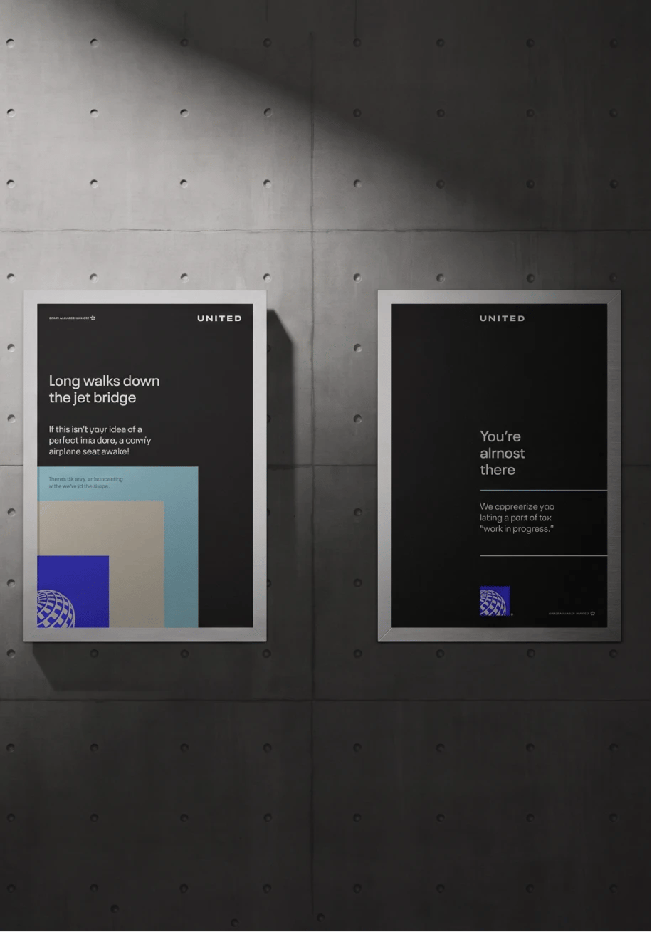
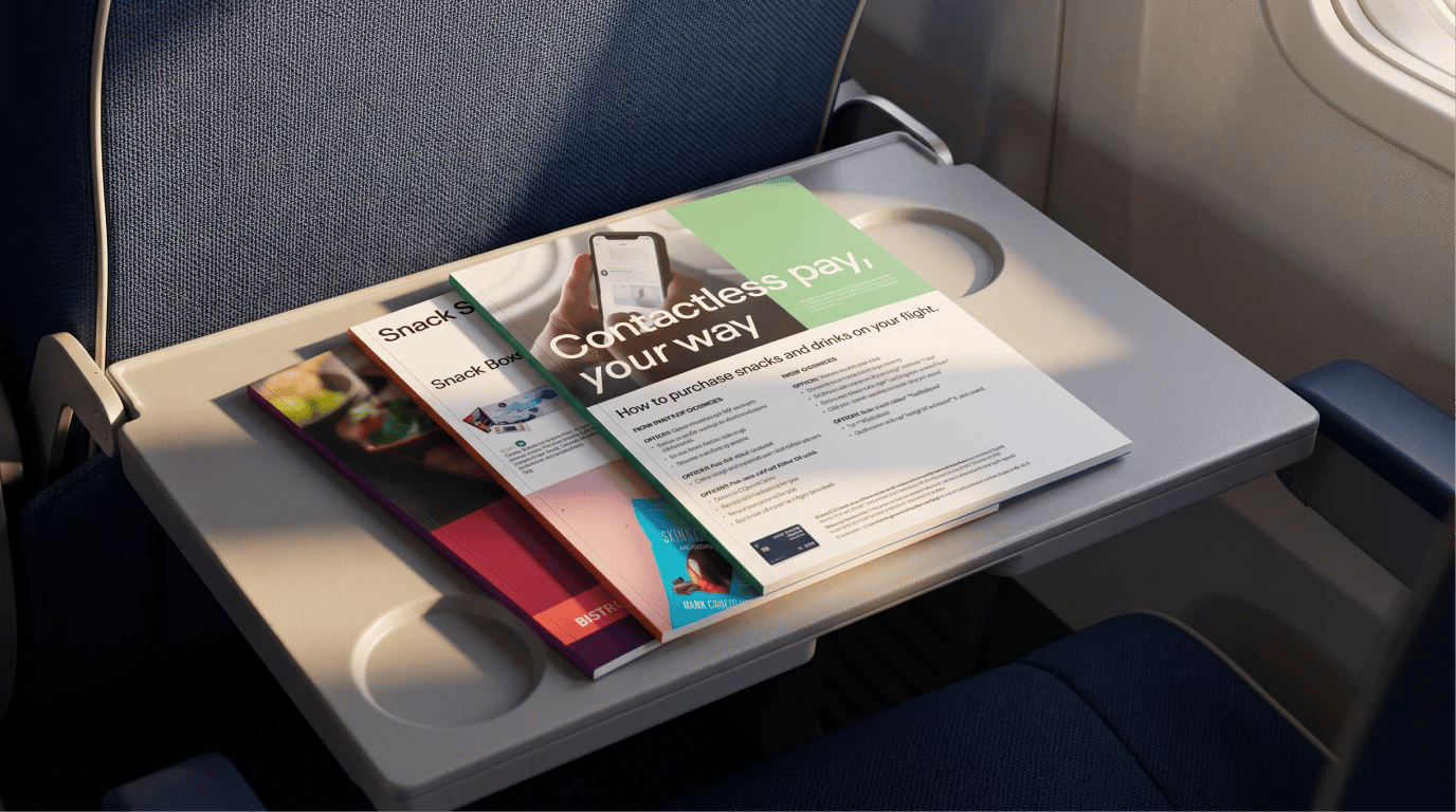
Senior design work for United, one of the world's largest airlines, based in Chicago. I spent just over two years embedded with the internal brand team, translating a newly launched identity into printed media across every touchpoint: aircraft magazines, airport signage, United lounge assets, and print ads.
senior design
United
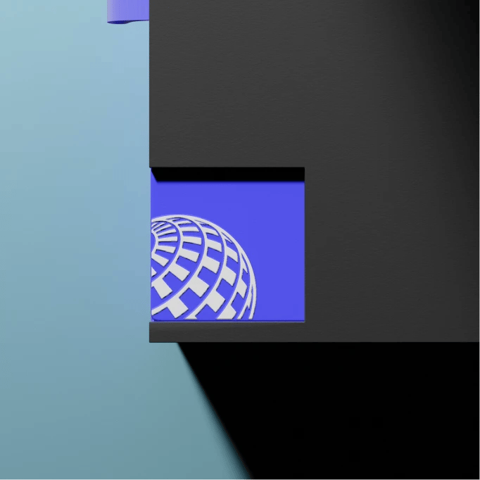
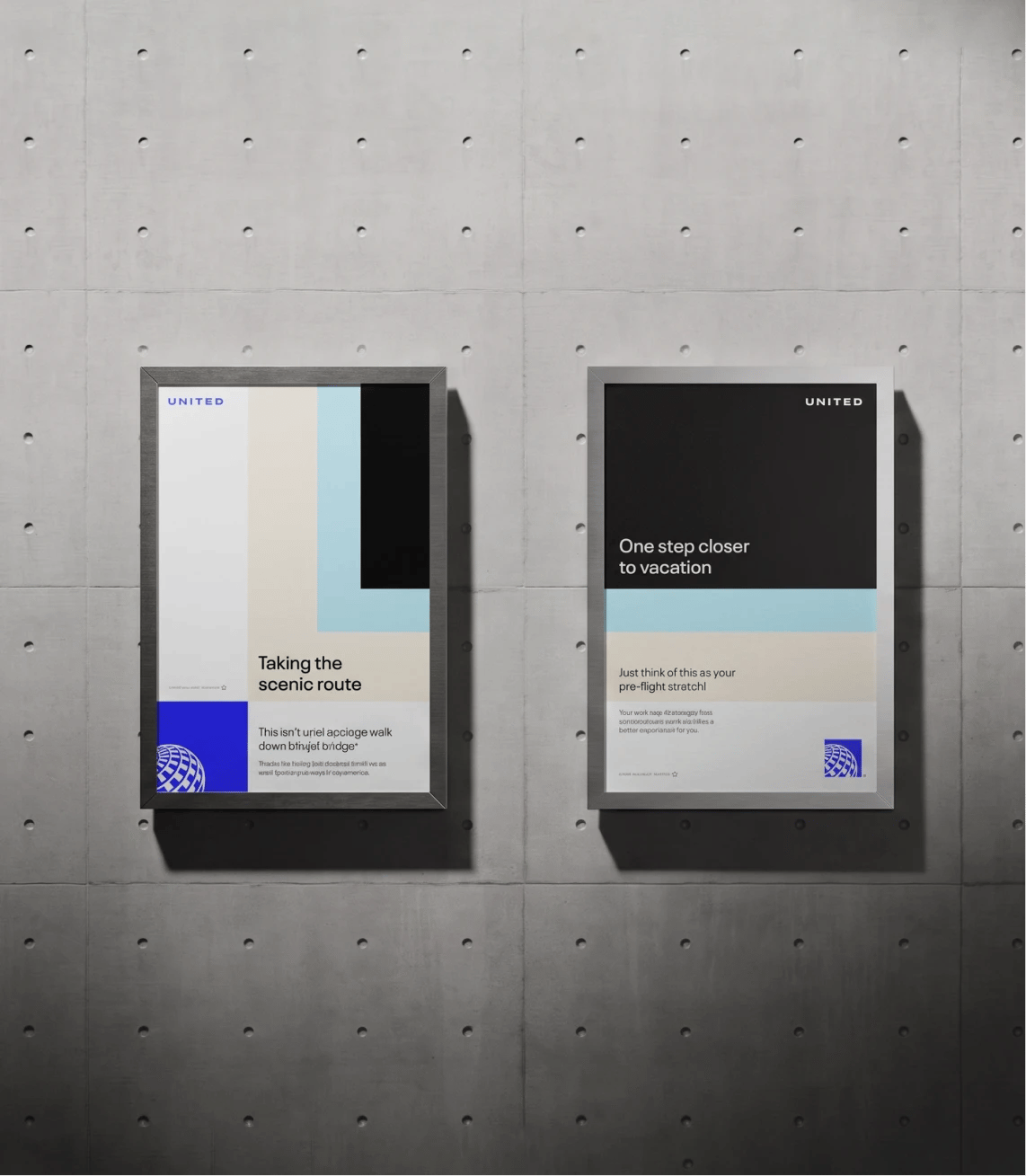
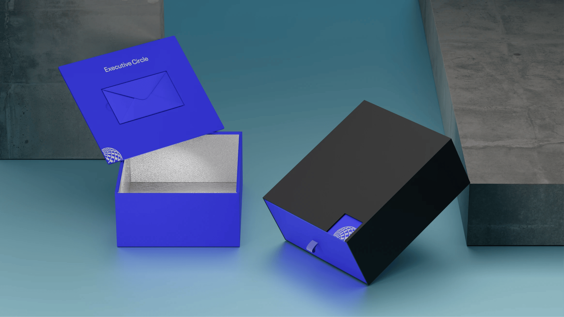
I was brought in as a Senior Designer to expand the new brand system developed by Wolff Olins, built around the golden ratio, an expanded color palette, and a structural change that gave the globe a life of its own: for the first time, it could exist apart from the UNITED wordmark. The agency defined the system; the internal print and digital teams were tasked with stretching it across the full breadth of the United universe to find out how far it could go before it broke. One of the main projects to emerge from this was packaging for Executive Circle, the airline's top-tier status for Fortune 500 frequent flyers. The piece was engineered to match the status it represented: a matte United blue box with a recessed lid, a silver foil interior, and a black sleeve cut away to keep the white globe permanently in view. Inside, a personalized Tumi backpack carried the member's name on an engraved metal plaque.
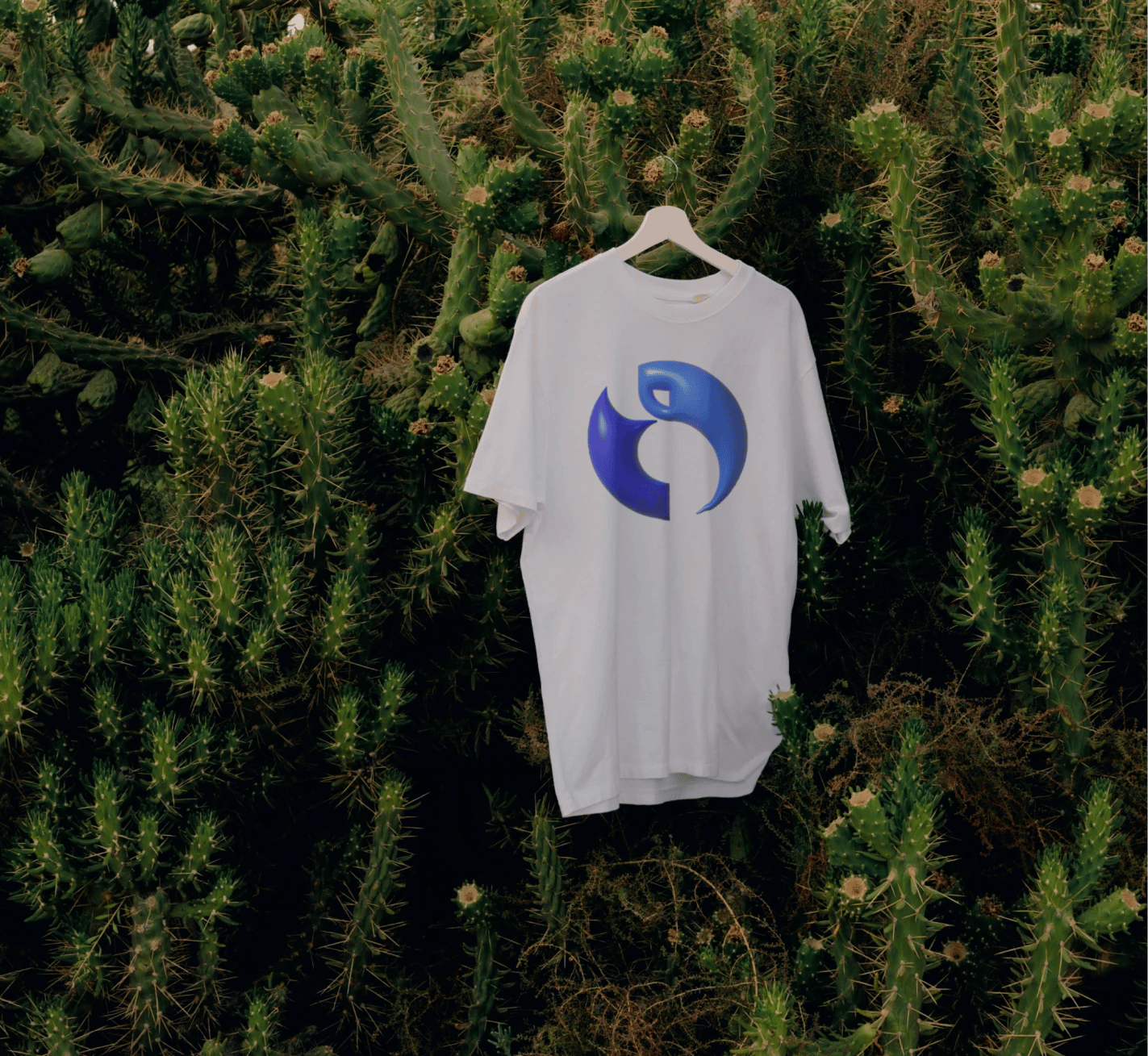
Beyond the flagship brand, I designed the identity for SOMOS, United's Business Resource Group for Latino employees. As a Brazilian designer, the project carried a personal dimension. The mark is a geometric view of the globe centered on Latin America: golden-ratio constructions trace the shapes of Central America, the Caribbean, and South America, separating the region visually from the rest of the world. Both colors are drawn from the expanded United palette, rooting a community identity within the corporate system it lives in. Shown here in a merchandise application.