Brand redesign for Farmer Campus, a woman-founded company providing farmer-centered online education for sustainable agriculture, with roots in the agroecology, farmer-to-farmer, and food sovereignty movements. Beginning in 2022, I rebuilt the company's visual identity and carried it across every surface the brand touches, from print to web. What started as a redesign has grown into an ongoing collaboration: the mark now anchors everything the brand publishes for the farming community.
design direction
Farmer Campus

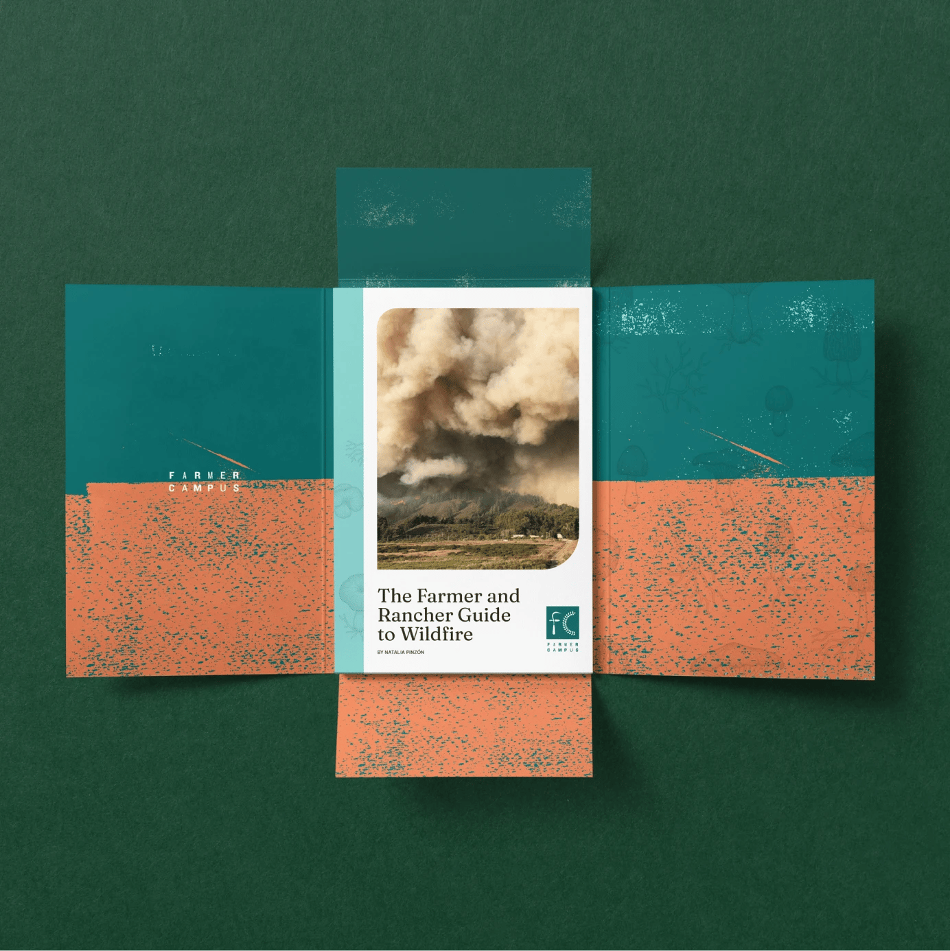
The logo is built from the brand's own vocabulary. The F is assembled from agricultural hand tools, a nod to the practical, hands-on nature of their teaching. The C references the bay laurel, laurus nobilis, a symbol of wisdom and the root of the word baccalaureate. The variable weights of the wordmark draw on an American wood-type tradition of the 1800s, when each letter carried its own character, echoing the individuality of an agrarian life. The identity extends into print through folders, stationery, and collateral for programs like The Farmer and Rancher Guide to Wildfire.
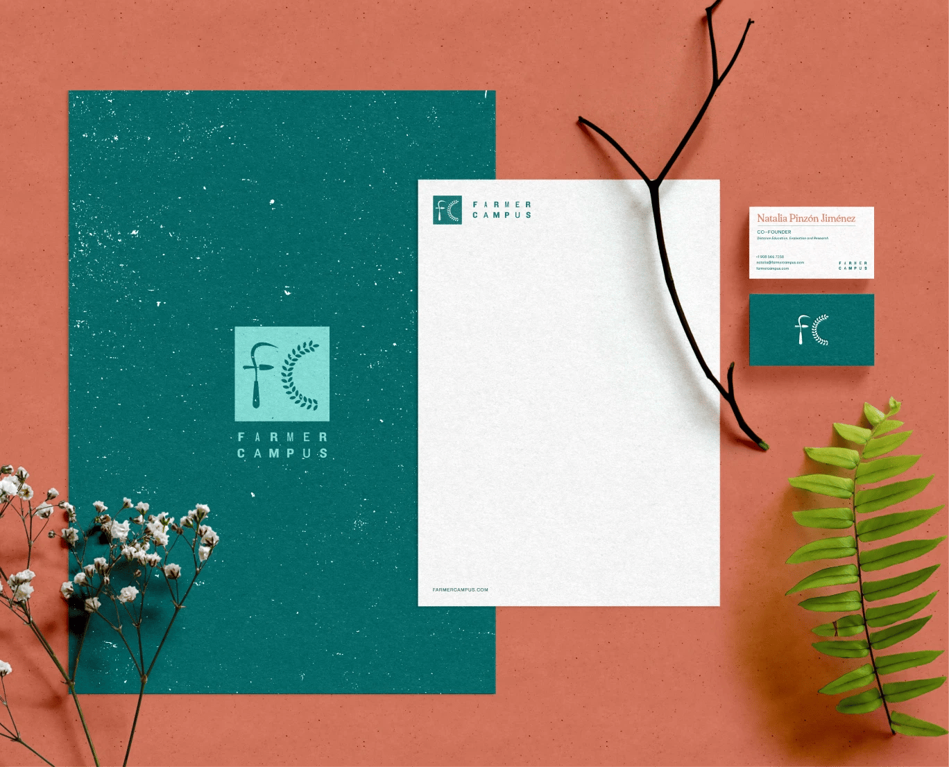
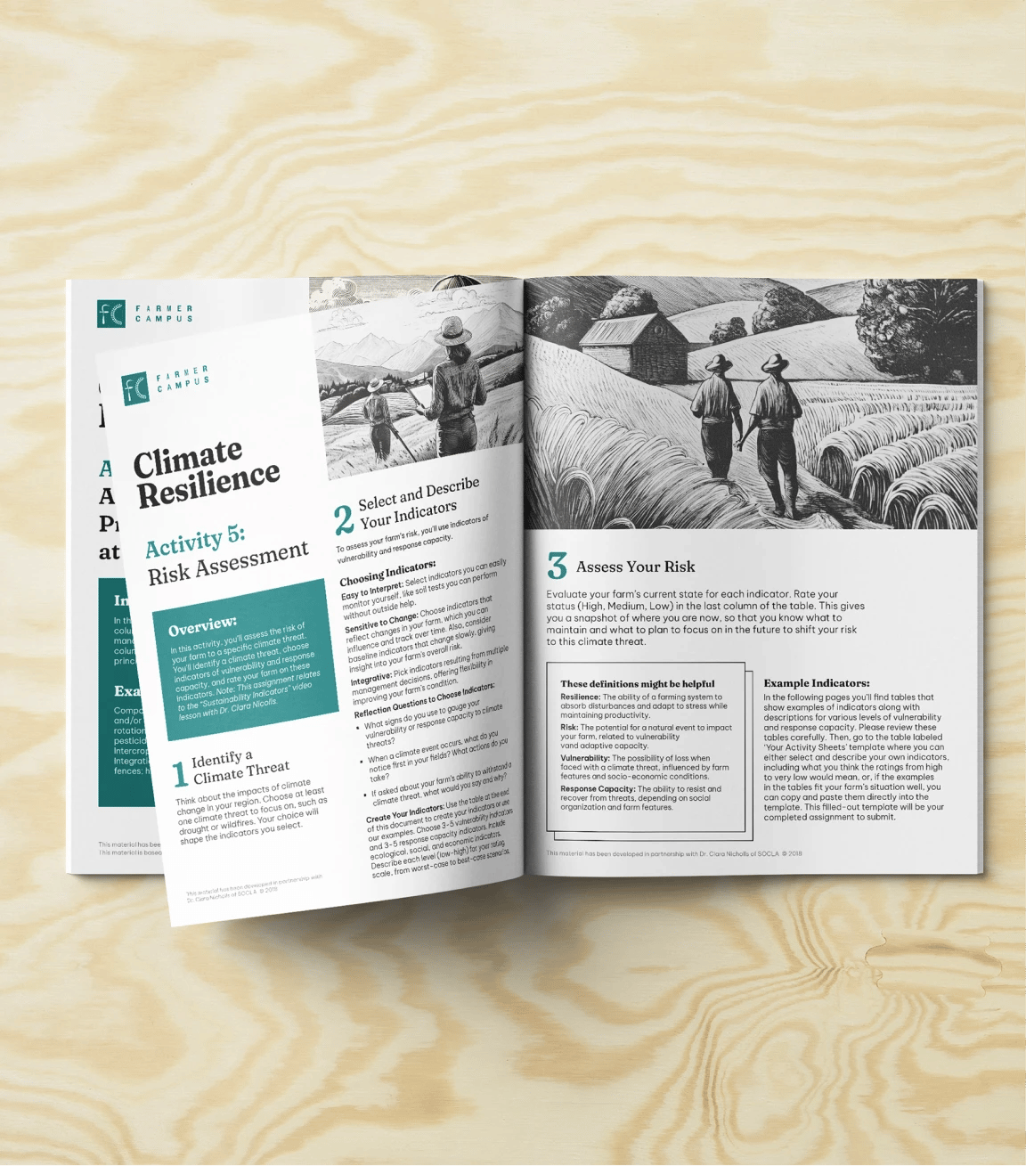
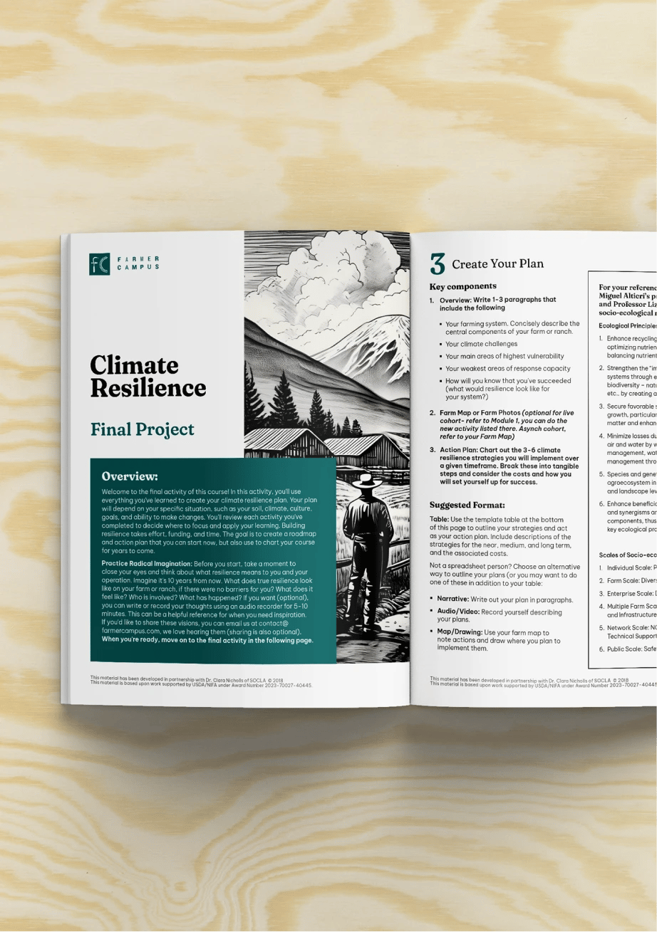
A large part of the work is educational by design. The Climate Resilience materials, part of the brand's certificate programming, pair workbook-style activity sheets with woodcut-style illustration: documents made to be written on, folded, and carried into the field. The color system pairs deep teal with terracotta and warm neutrals, drawn from soil and foliage, and holds together from course PDF to website.